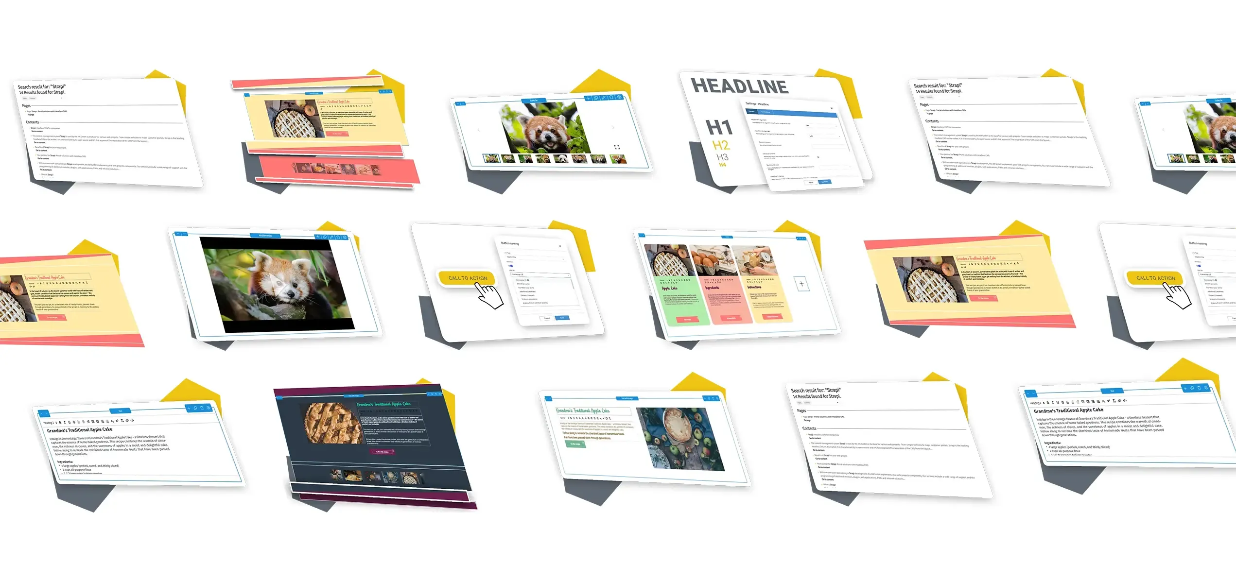
Content Elements Of The PageBuilder
Our centrepieces in the PageBuilder for a modern and fast page layout building!
The PageBuilder has the perfect tools for most use cases. Over ten content elements are already available to you on delivery to create varied content in your style and branding. New content elements can be added.
There are no limits to your creativity, because the configurations in the Global Design Settings Store can create completely different variants for any purpose, even from a single element. We will be happy to advise you about customised portal solutions!

You can have a look at all the content elements from the PageBuilder for Strapi right away.
Or: We can show you everything to try yourself on this demo page. How does that sound?
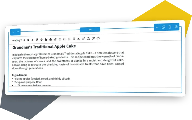
Rich Text Editor
Content Management without programming knowledge in the WYSIWYG Editor! Simple text editing with our Rich Text Editor (RTE) including Link Chooser for internal and external links.
- Editing of the source code possible
- Preconfigured text formatting
- Defined formatting availabl
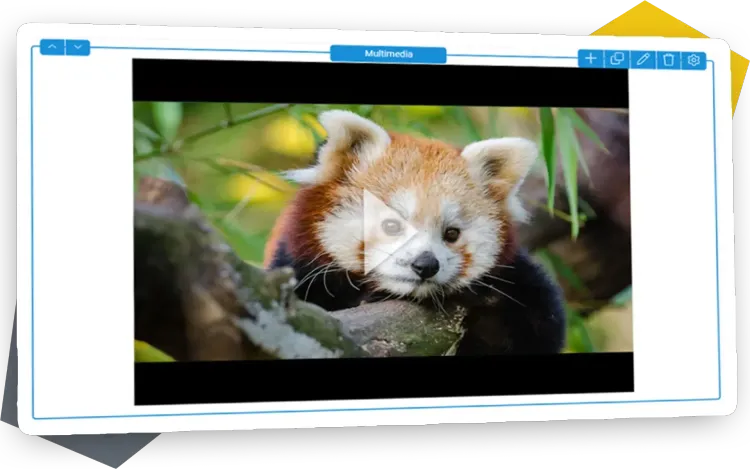
Multimedia
Moving images, sound delights and lots of creativity in one element! This is how visual content is displayed in the PageBuilder for Strapi and the user experience of your content is improved.
- Add media via the Media Manager
- Images, audio, YouTube and self-hosted videos
- Individual customisation of the image display
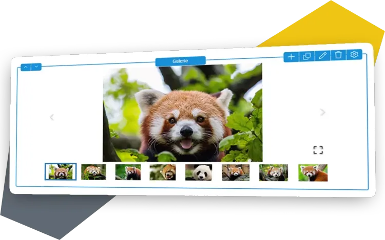
Gallery
Placing twenty product images clearly on one page - no problem! The Gallery is perfect for presenting numerous media in a small space.
- Media Management via Media Manager
- Display in slide, grid or masonry mode
- Simple operation of the Gallery slides
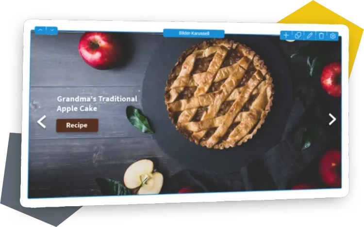
Carousel - Hero Images
In addition to the classic function as a static header image, a text editor and call-to-action elements for scrollable content teasers are also available.
- Carousel with Headlines, Rich Text Editor and Buttons
- Responsive versions for a better User Experience
- Simple addition and deletion of Carousel slides
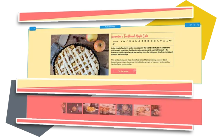
Section Separator And Spacer
Give your content enough room to breathe! The Section Separator stylishly delimits sections, while the Spacer provides individual space and distance for all elements.
- Aesthetic spacing and white space between content
- Clear, visual hierarchies between content elements
- Visual templates for the Section Separator included
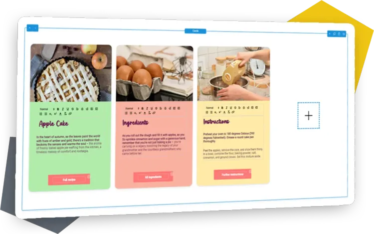
Cards
Use Cards to place content clearly and uniformly! As teasers with links to other content or for clear data in the grid. Images, headings, texts and buttons are possible.
- Design possibilities with many design options
- Flexible configuration of individual Cards in the layout
- Customised number and arrangement of Cards
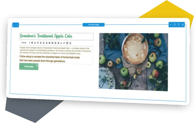
Text With Image
Brighten up your texts with images or videos! The Text with Image element consists of the Rich Text Editor combined with a media element in a horizontal or vertical arrangement.
- Attractive presentation of image or video + description
- Positioning (next to or on top of each other, sequence)
- Adjustable aspect ratio of both sections to each other
Accordion
With the Accordion, the famous "wall of text" is history! The content element is used to present extensive information in a small space, perfect for an FAQ.
- Space-saving, organised presentation of content
- Collapsible elements can be managed dynamically
- Customisable order possible with just a few clicks
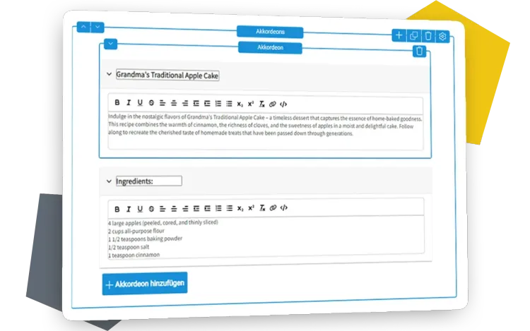
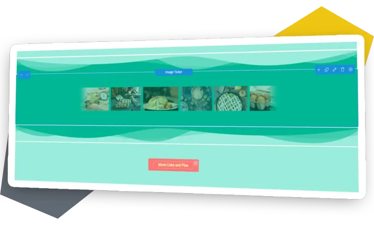
Image Ticker
Room Divider, scrolling image and static display in one content element! Either as an animated ticker or static image display, the Image Ticker brings many images into a row.
- Choice between static and animated display
- Images can link to other pages (internal/external)
- The size of the images is standardised

Congratulations, you have almost completed the overview of the content elements!
Now it's your perfect time to licence the PageBuilder for Strapi.
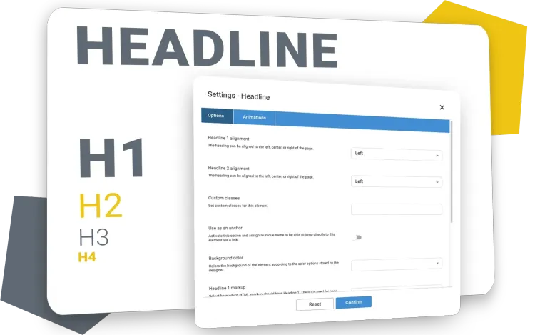
Headlines
Page titles and headings are important for structuring your website, for users and search engines! You can create an SEO-friendly headline hierarchy with just a few clicks.
- Headline (H1, H2, H3, etc.) for a clean page hierarchy
- Configuration options for headline style and markup
- Definition of headline alignment and background colours
HTML
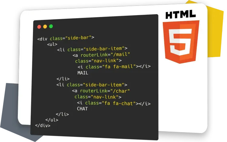
Bring creativity and individuality to your website! Integrate HTML tags, CSS styles and scripts directly as source code. Design layout elements and tables without any compromises. Perfect for anyone looking for something special.
- Ideal for unique designs and features
- Use of HTML, CSS and scripts
- Quick implementation of creative ideas
Buttons
Buttons are truly the best way to click a text link! From navigating and triggering a specific action to transferring parameters and submitting forms.
- Design sets with several button styles possible
- Suitable for internal and external links
- Link Chooser with references and parameters
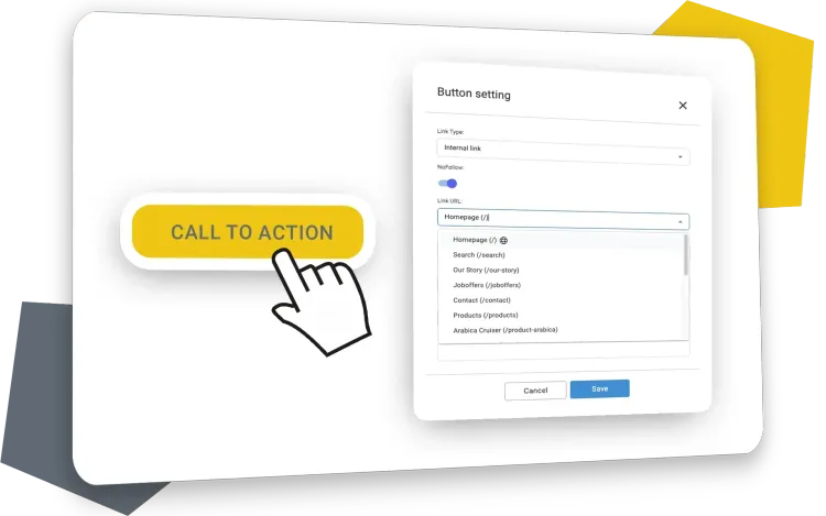
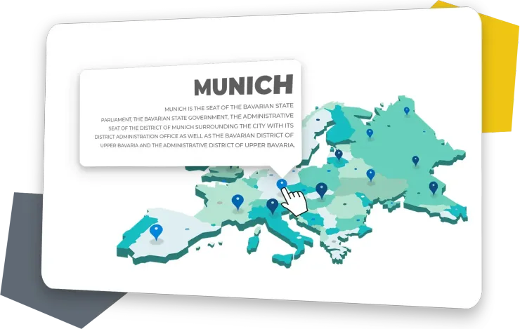
Image With Markers
Turn images into interactive eye-catchers! Position markers and text boxes directly in the image, color-coded and with icons to present additional content effectively.
- Ideal for a lot of information in a small space
- Make additional content visible interactively
- Markers can be adapted to the CI
